I’ve been meaning to write something about simplicity and the Mac for a while now, but have been super snowed-under with projects (note to any editors I’m currently messing around: I’m on it – promise!). Basically, I’m sensing that something’s changing within the Apple user/developer community: following Jobs’ Back to the Mac event, more of us are coming to conceptualise the Mac as a kind of super-powerful minimalist computing platform.
Before we go any further, let’s see if we can pin down what ‘minimalism’ might mean in this context. At a stab, I’d define a minimalist application as one for which delightfulness of experience trumps sheer size of feature set. A minimalist application isn’t an application that “does less” – it’s an application that does less, in order to do better.
The old computing paradigm involved developing applications that could provide the most functionality for the most users. Key words here include: design by committee, feature creep, bloat, preferences. In distinction, the new minimalist paradigm involves “scratching your own itch” – developing a tool to meet your own specific needs, and meeting the needs of your user base only insofar as those needs match your own. Marco Arment, developer of Instapaper, removes features from his iPhone and iPad applications he finds don’t properly suit his needs. The result? The possible alienation of a small fraction of his app’s userbase, but a better product overall.
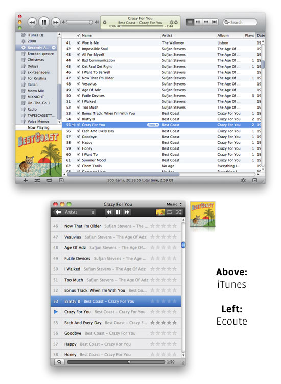
The Mac offers developers the chance to create minimalist applications many times more powerful than those on iOS. But what does this mean, in a practical sense? Reeder (RSS reader), Sparrow (mail reader) and Ecoute (music player) are part of what I imagine will soon become a slew of Mac apps that make simplicity their selling point. Ecoute, for example, makes use of the user’s iTunes music library, but doesn’t allow the user to add new songs, create playlists, sync their iDevice, or purchase media. (This functionality is effectively ‘outsourced’ to iTunes). By stripping any functionality that isn’t strictly necessary to listen to music, the Ecoute developers have been able to spend their time tweaking and polishing the basic “Ecoute experience”.
There’s a delightfulness to the Ecoute user experience that you don’t find in iTunes. Ecoute draws on iOS conventions: tap on a song or playlist and the new “screen” slides in from the right (in the same fixed window). When a song is playing, the main window fills with the album artwork: mouse over that artwork and the play controls fade in. The application is dynamic – at any point in time, a bare minimum of necessary information is displayed to the user, making it easy to focus on what’s most important. You don’t see a list of playlists when you aren’t browsing playlists, you don’t see play controls when you aren’t playing a track, and the search bar slips behind a magnifying glass button when it isn’t required. Most importantly, the application is fun: there’s something a little exciting about sliding across playlists and “into” a song – a kind of ‘aliveness’ wholly missing from iTunes.
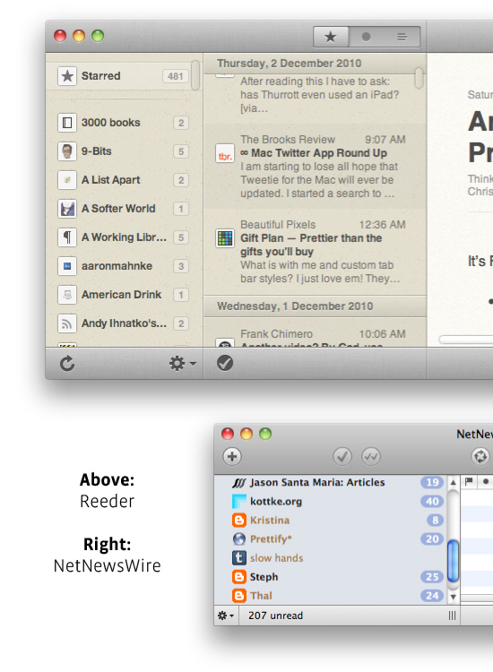
The developers of each of these new minimalist apps are pushing away from Apple’s human interface guidelines and creating their own non-standard interfaces: custom scroll bars, buttons, title bars, sliders, and so on. Reeder, for example, features non-intrusive iOS-inspired ‘flat’ scroll bars (without ‘wells’ or arrows), and a gently textured title bar in which the standard ‘traffic light’ window controls are positioned several pixels lower than is standard in order to achieve a sense of visual balance. Backgrounds in the main Reeder window are subtly textured to give the appearance of real-world folders and sheets of heavy paper. This approach comes in contrast to a feature-comparable application like NetNewsWire, which generally adheres to Apple’s interface guidelines.
There’s a question of whether, going forward, Apple should enforce strict guidelines on how Mac applications should look: to make the OS interface adhere to a clearly-outlined set of standards. When OS X was first introduced, almost a decade back, most developers created applications using the standard ‘Aqua’ sliders, buttons, and interface elements. Because of this, there was a stylistic consistency across OS X applications: a user could jump from one app to another and expect a generally similar visual experience (in stark contrast to Windows). Now, though, there’s a sense that, for any application to stand out, the experience has to go beyond what the user expects from the operating system. An application constructed in accordance with Apple’s interface guidelines might make for a more cohesive OS experience, but there’s nothing delightful about clicking stock-standard buttons, sliding stock-standard sliders, etc. It makes sense that a music player should look different from a mail client, which should in turn look different from an RSS reeder or Twitter client. Because NetNewsWire, for example, makes use of standard OS X interface elements, there’s nothing exciting about how the application looks or behaves. The user experience is standard, but humdrum. There’s nothing, beyond the feature set itself, that makes me want to use NetNewsWire.
Reeder, on the other hand, has an immediate visual appeal. Interface elements are close enough to standard to not look gaudy, but there’s a sense that, “Wow, this is something new.” More than that, there’s a sense that interface elements haven’t been customised purely for the sake of customisation, but for a purpose: to make the application experience as commonsensical, as immersive, as delightful, as possible. Making minimalistic OS X apps is about sweating the details, and part of that is beating Apple at their own game: making the interface more elegant than the OS standard.
The future of the Mac OS? If you’re running Ecoute, or Sparrow, or Reeder: you’re looking at it.
